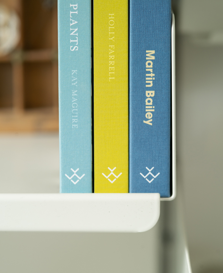
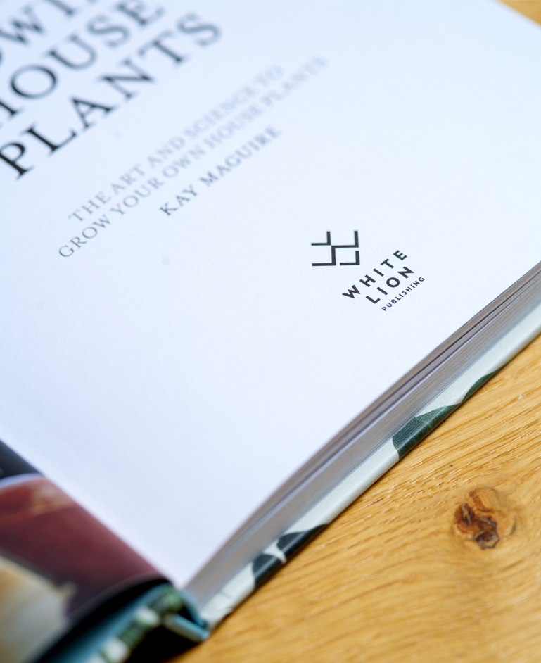
White Lion Publishing+
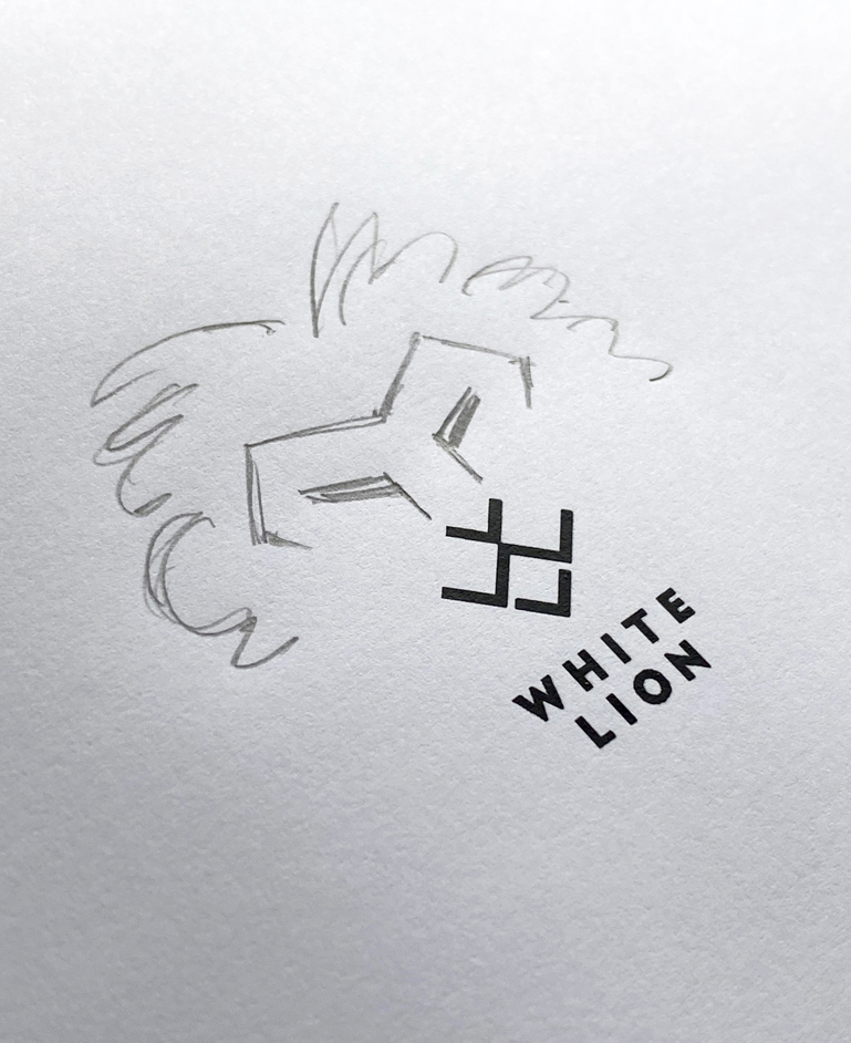
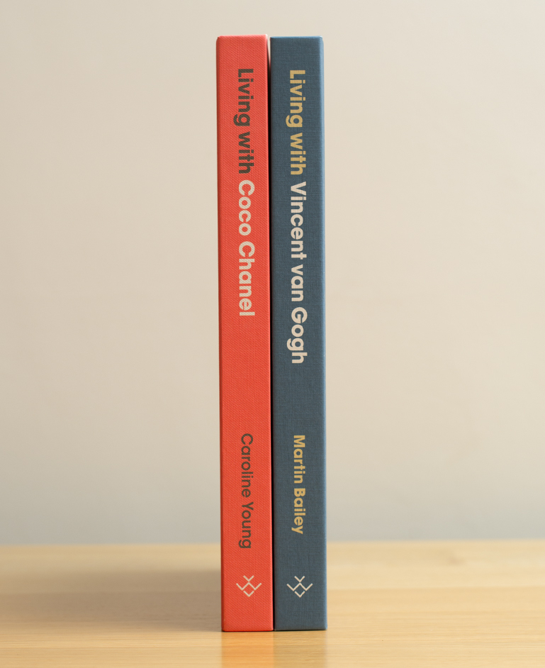
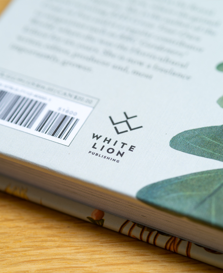
When Quarto merged three of their publishing imprints into one, they asked Untitled to create a new brand to represent ‘White Lion’, based at Quarto’s headquarters in White Lion Street. The logotype needed to be a simple, distinctive shape that would become immediately recognisable on book spines, imprint pages and other promotion materials. Our solution was to position geometric ‘W’ and ‘L’ shapes together to suggest the mouth and nose of a lion.