Counter Albion+
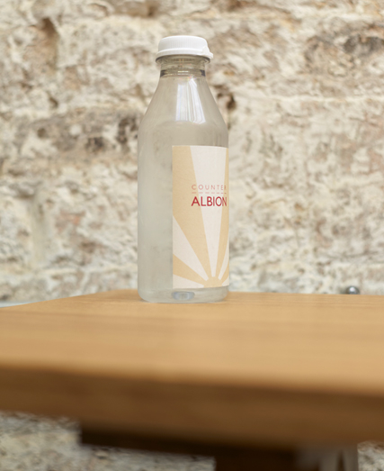
In 2009, Albion opened its first café and delicatessen in Shoreditch, its mission was to bring no-nonsense, modestly-priced, seasonal British food to it’s ever appreciative customers. Counter Albion is Albion’s little brother and offers a more informal, canteen-style experience with food and drink served from an large display counter. Untitled were commissioned to develop a new brand identity and to roll out the visual identity across all of its stores. The food served is lighter than those served by its bigger brother and so our logotype also became leaner and featured intriguing dashed lines. The reason for these lines becomes apparent as soon as you enter the store, where annotated dashed lines are painted on the floors, walls and furniture to help you find your way around the different sections of the shop.
Photography Julian Anderson / Paul Raeside